

HOT POT
Palatable Tour
2022.2-2022.4
Identity /Branding
This project is to design a complete system for a hypothetical company, including naming, logo, website, and all design applications

BACKGROUND
Hot pot- Palatable Tour
Palatable Tour is a company that provides a fun way to experience hot pot virtually, people will be exposed to interesting cultural information through interactive media, they can enjoy, explore and see the story behind the hot pot and learn about the significance of Chinese culture through the exploration of ingredients in traditional hot pots. The intended audience would be people who are interesting in hot pot and willing to explore Chinese culture.
The name of the organization comes from the mission of the whole company which is to bring people to another culture as real tourism through experiencing food, which is a palatable way.
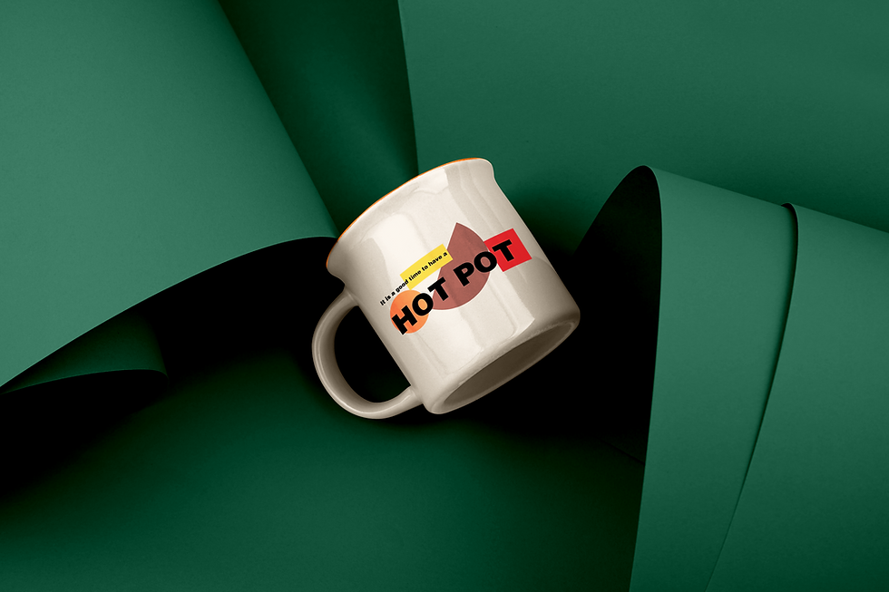
The logo mark of this company is built by four shapes representing a real hot pot with different types of ingredients in it, which is the typical characteristic of a hot pot. Two stripes represent the chopsticks that somehow interact with the food there.
Letter and icon fusion into one: Four different shapes in the mark can all be a part of the typography, expressing the characteristics of tolerance, acceptance, and fusion of the hot pot. It's now an entire iconography. This is how a hot pot works.


identity
Palatable tour logo is made up of three elements: a symbol, typography, and a tagline. Each shape in the symbol can be integrated into the “HOTPOT” typography.
The shapes overlay each other, In the black and white version, the rectangle in the front would be white and the circle will have a white outline as well.

The color palette is also inspired by traditional hot pot, which brings a feeling of experience freshness, and excitement.


Business Stationery


tYPOGRAPHY


wEBSITE
High appealing visual assets and playful motion to guide people to explore.
The illustration style for the assets is simple but highly generalized with a vibrant and dynamic color palette, not necessarily realistic, Strong visual impact will bring a pleasant visual experience with dynamic effects.


WORK PROCESS
1 Logo digital sketches
.png)

2 Selected direction iterations
.png)
.png)
Design System Breakthrough
With the direction I have now, I start to try more interesting combinations and applied color to them, and finally did a breakthrough.


.png)
Business card
Once I figure out the logo mark, I started working on applying it to materials as a system, the first thing I did is a business card, I tried tons of different versions until I got a satisfied one .


Design reflection
A design system has a life of its own, it will grow and evolve over time in ways you never expected., it is never finished, so be agile and make small releases that will elicit feedback. Iterate and action and most importantly created an environment where all designs - components, modules, layouts were in order.